KidQuest
Designing Activities and Checkout web pages

Gwen Internship
As part of my internship with GWEN, I had to complete 7 design projects. Project 3 had the following description:
- Work with Vinny, a passionate product manager at Praxis Studio, on designing key pages for KidsQuest - an afterschool activities marketplace
- You'll create mid-fidelity wireframes for activities and checkout pages, navigate unexpected client pivots, and learn how to handle changing requirements
Activities Page
Objective
Build a mid-fidelity wireframe for an activities page of an afterschool activities marketplace
Challenges
- Build from scratch
- Fulfill all requirements in the scope
- Avoid scope creep
Scope
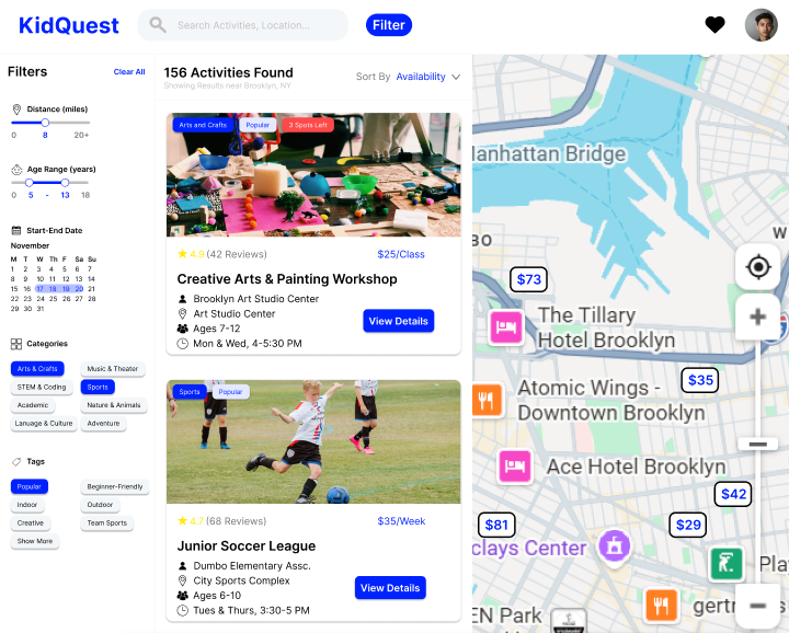
- Header with searchbar and filter
- Map function with minicard
- Activities list with sorting, on card: location, vendors, ages, ratings, price, time
- Filter options: distance, age, calendar, categories
Process
Problem Identification
Ideation
Design
Feedback and Redesign
Problem Identification
Problem: How do parents sort
and search activities to find
the right one for their child?
Ideation
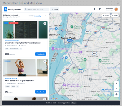
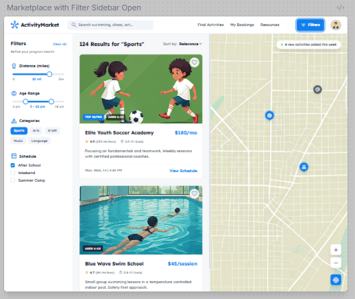
Used Stitch to generate design ideas
From design 1: activity list, map layout, header
From design 2: filter sidebar

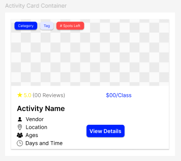
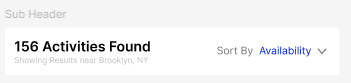
Design
Created design elements to meet scope:
Header (filter button, search bar)
Subheader (sorting function)
Activity Card (vendor, location, age, time, rating, price)
Initial Design
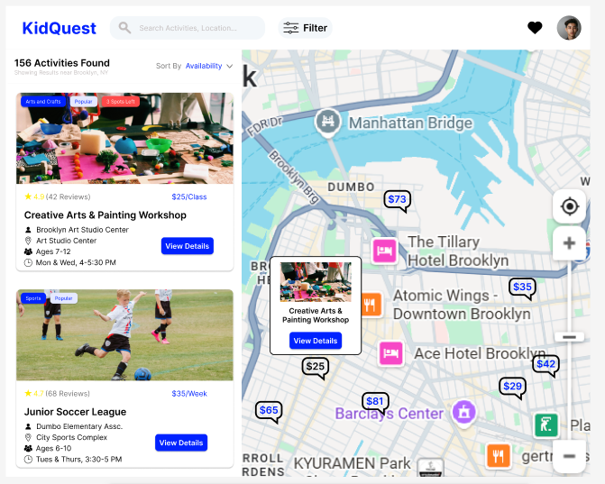
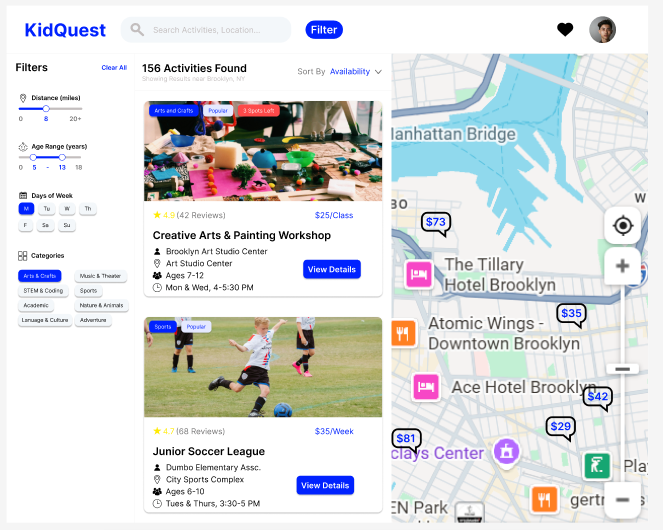
Problem: How do parents sort and search activities to find the right one for their child?
Solutions: Intuitive list with sorting, map function with minicard, filter function
Impact: Parents have multiple ways to sort (sorting, filtering) and search (list, map) for activities
Feedback and Redesign
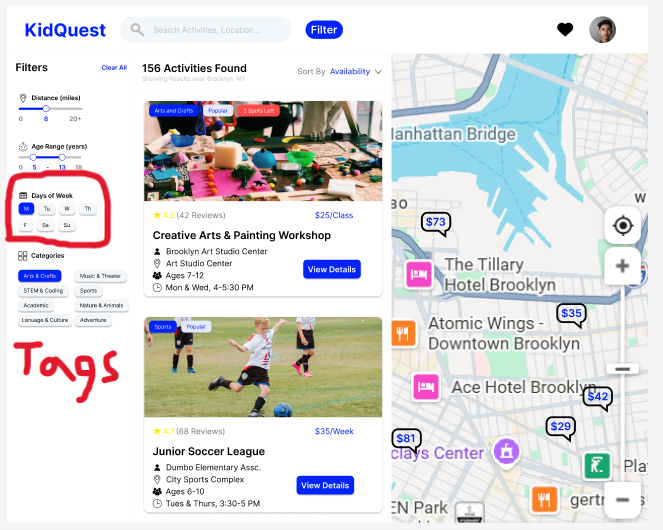
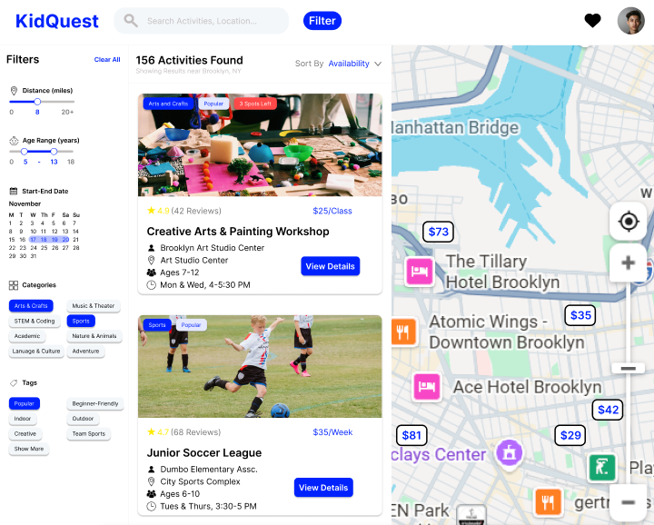
- Introducting a calendar function instead of days of the week
Impact: Increasing specificity -> Better filtering results - Scope Adjustment: Adding tags to filter sidebar
Impact: More control over results-> Saving time
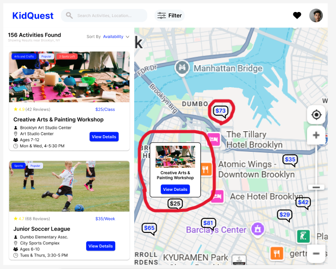
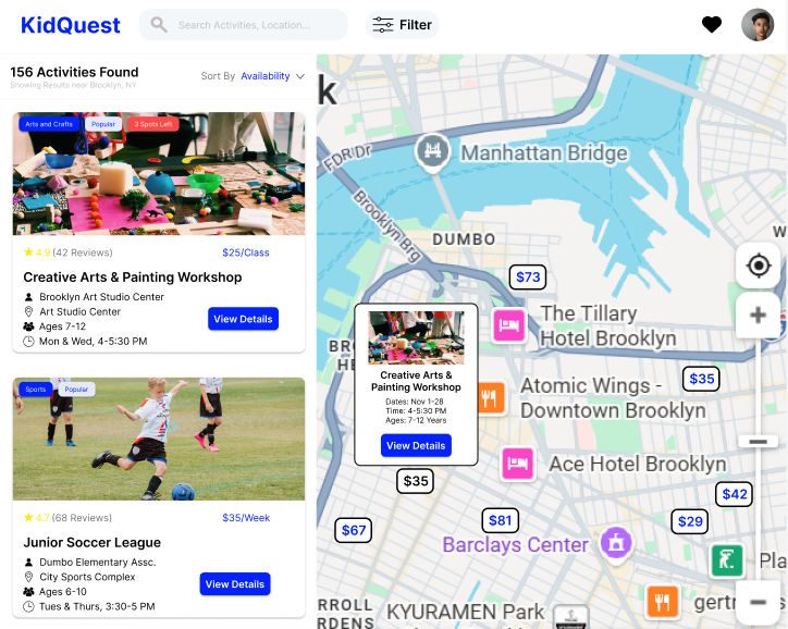
- Adding information to the map activity minicard
Impact: More information -> More confidence - Adjusting map activity design
Impact: Improve contrast and visibility
Checkout Page
Objectives
Build a mid-fidelity wireframe for the checkout page of an afterschool activities marketplace
Challenges
- Expansive scope
- Presenting a lot of information in a visually appealing way
- Creating an intuitive user flow
Scope
- Activities section: attending, name, time, vendor, add-ons
- Contact & Information: emergency contacts, notes, opt-ins, waivers
- Payment: saved methods, adding a new card
- Order summary: payment breakdown, promo code, T&Cs, security verification
Problem Identification
Problem: How do users complete the
checkout flow quickly and effectively?
Design
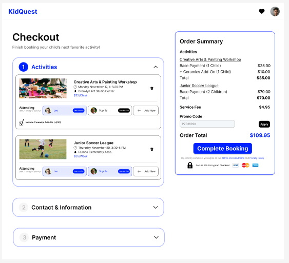
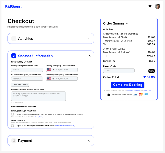
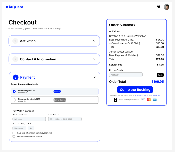
Problem: How do users complete the checkout flow quickly and effectively?
Solution: Multi-step checkout with clear action items and fixed order summary
Impact: Intuitive user flow that isn't visually overwhelming
Feedback
Received feedback on:
- Reworking call-to-action button depending on which
section is active and if the necessary fields are filled
- Indicating required fields in the information section
- Adding options to delete/update payment methods
Redesign
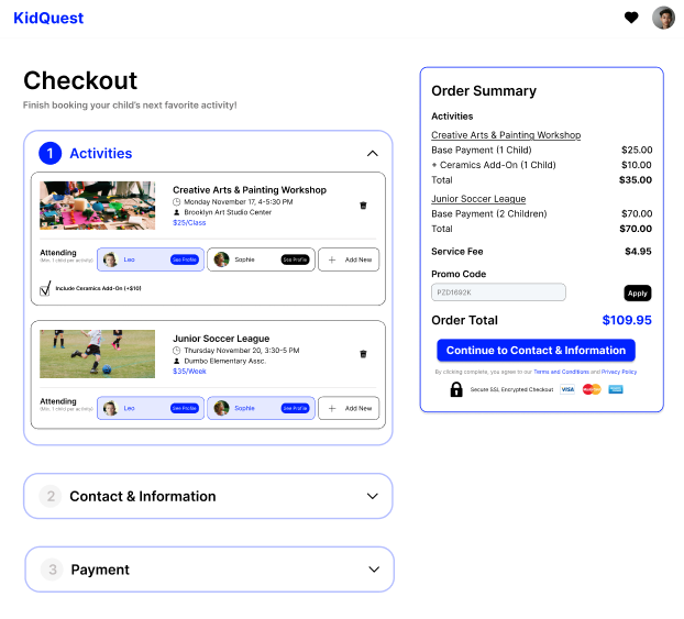
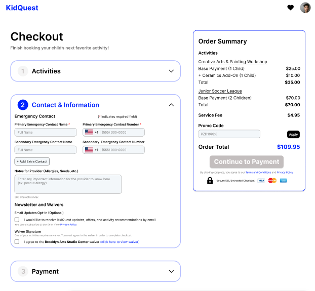
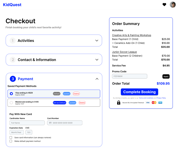
Impact of:
- Revised call-to-action button: Guiding users through flow
- Indicating required fields: Avoiding pain points
- Updating payment method buttons: Improve optionality
Lessons Learned
Hey there, this is the default text for a new paragraph. Feel free to edit this paragraph by double clicking on it. After you are done just click on the yellow checkmark button on the top right to save. Have Fun!
- It's important to go through multiple rounds of feedback and redesign
- Center the user flow, and the user's ability to complete the task
- Give the user options without presenting unnecessary information
Hey there, this is the default text for a new paragraph. Feel free to edit this paragraph by double clicking on it. After you are done just click on the yellow checkmark button on the top right to save. Have Fun!
Selected Works